Templates/folio
Template
folio
Photograph-led journals and studios
A folio of equal plates: every post is the same generous landscape picture with its title set light in a display serif beneath it, two across, with air between them. No lead story and no hierarchy; the eye chooses. The roundest template in the range.
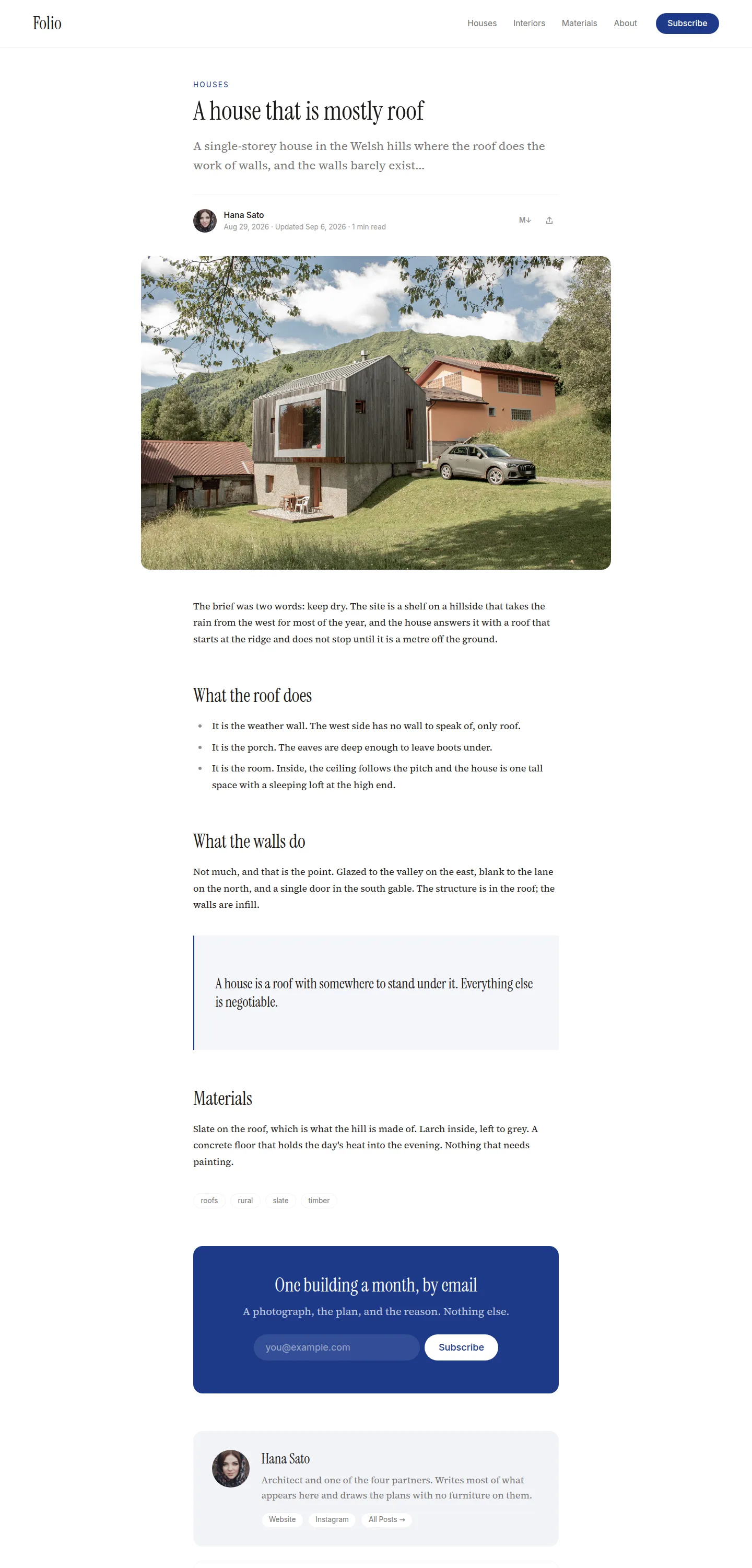
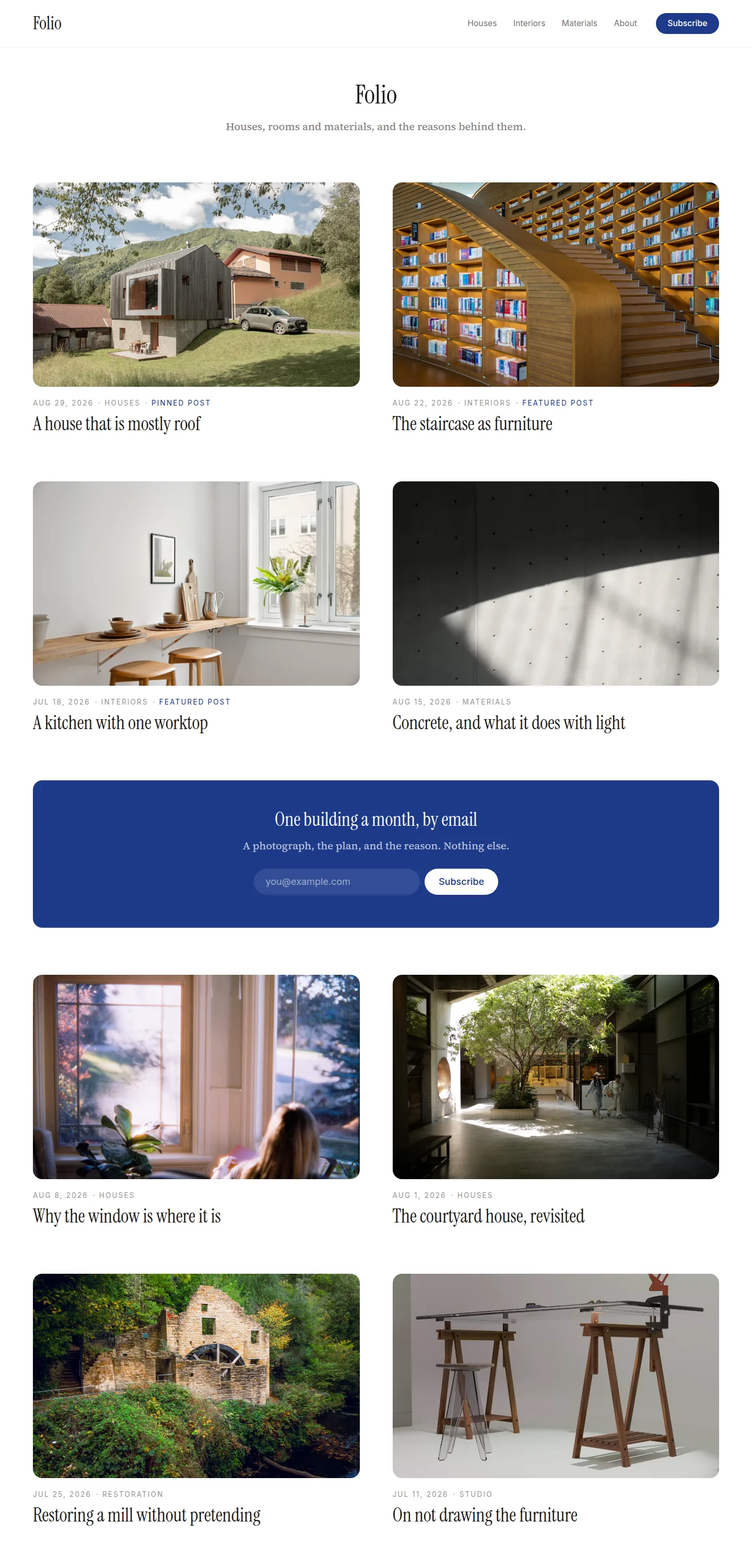
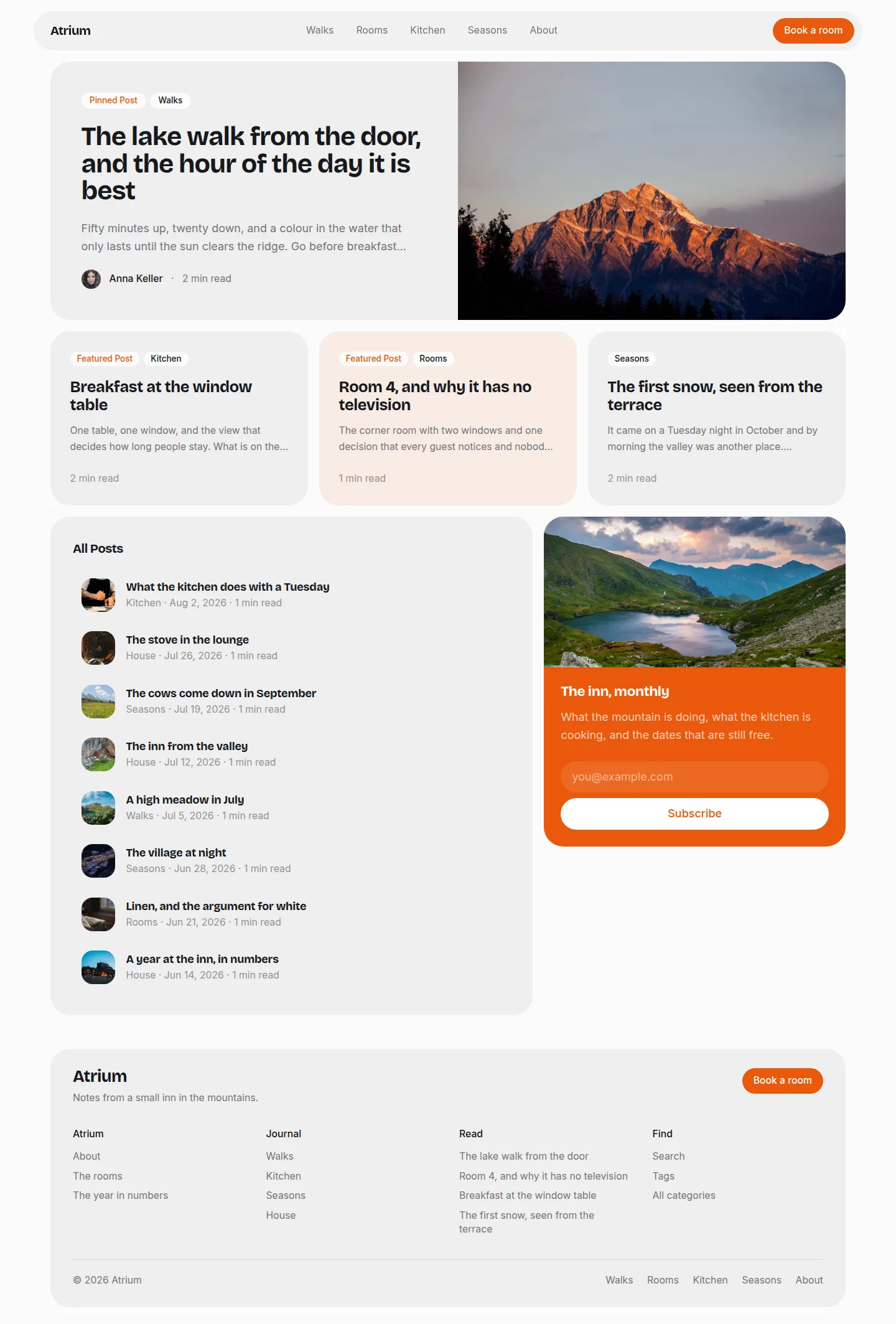
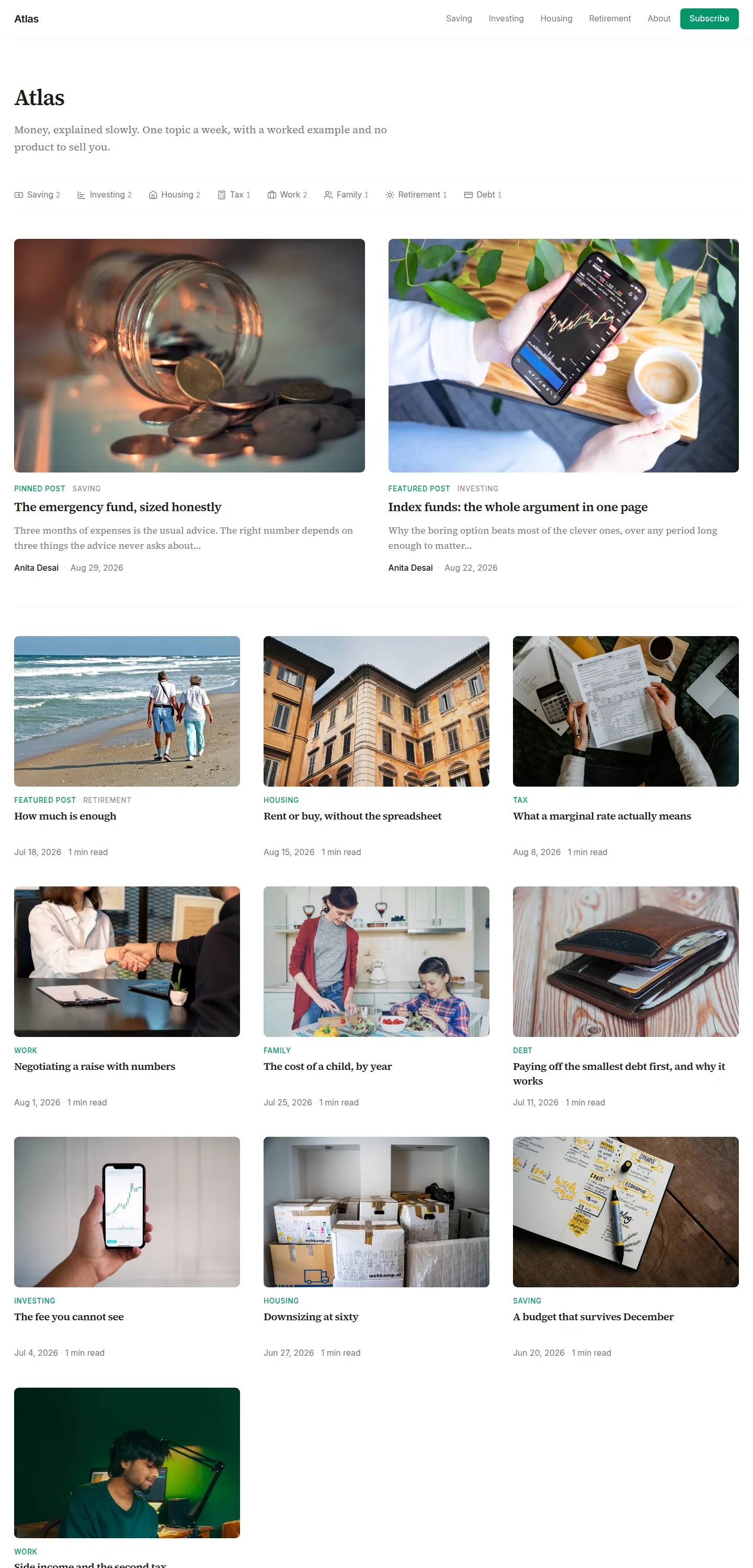
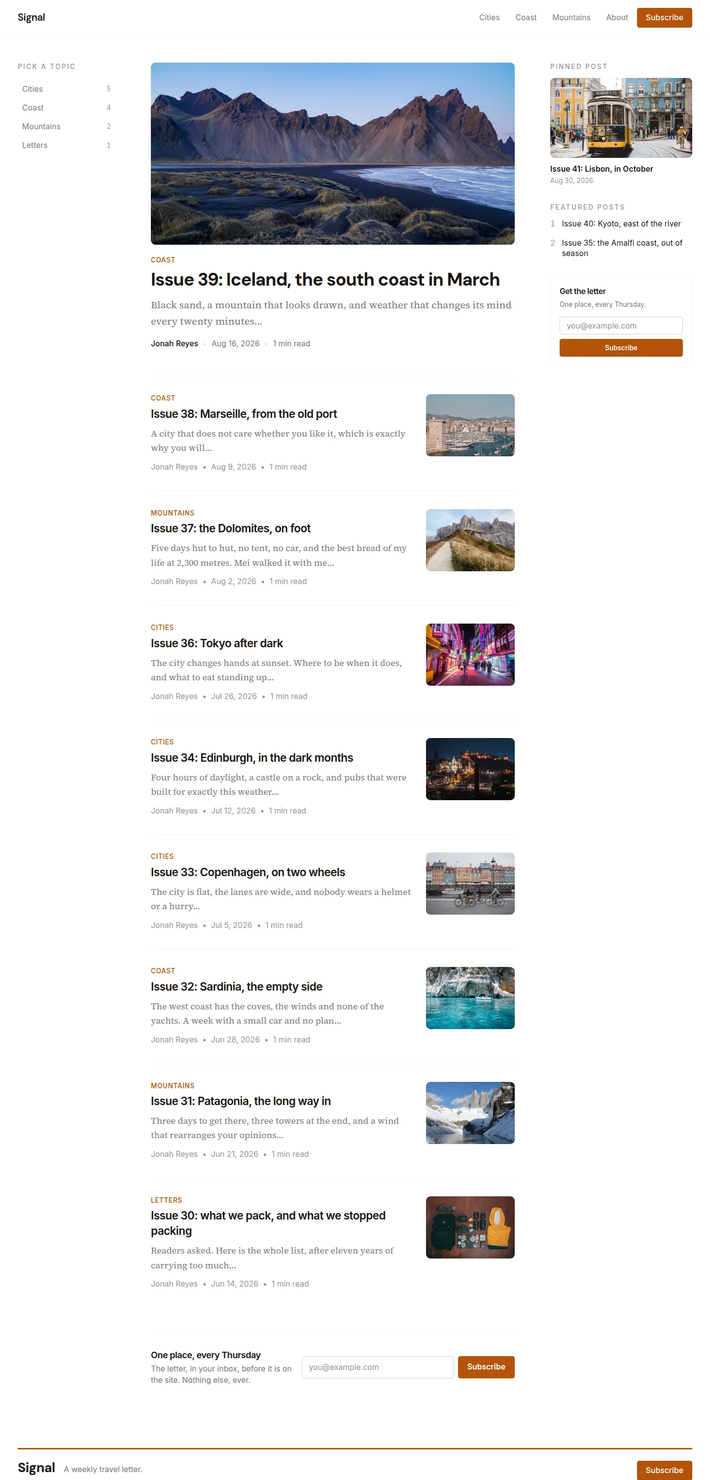
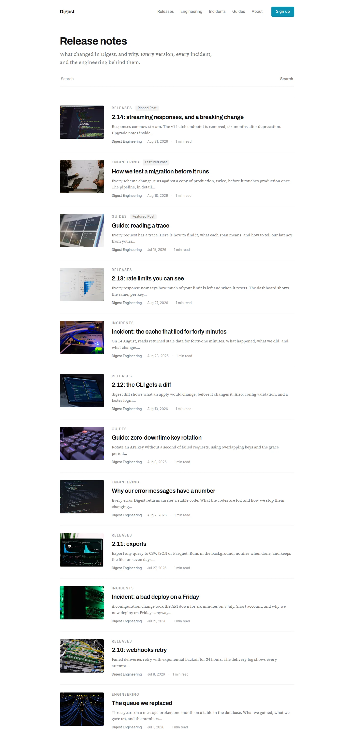
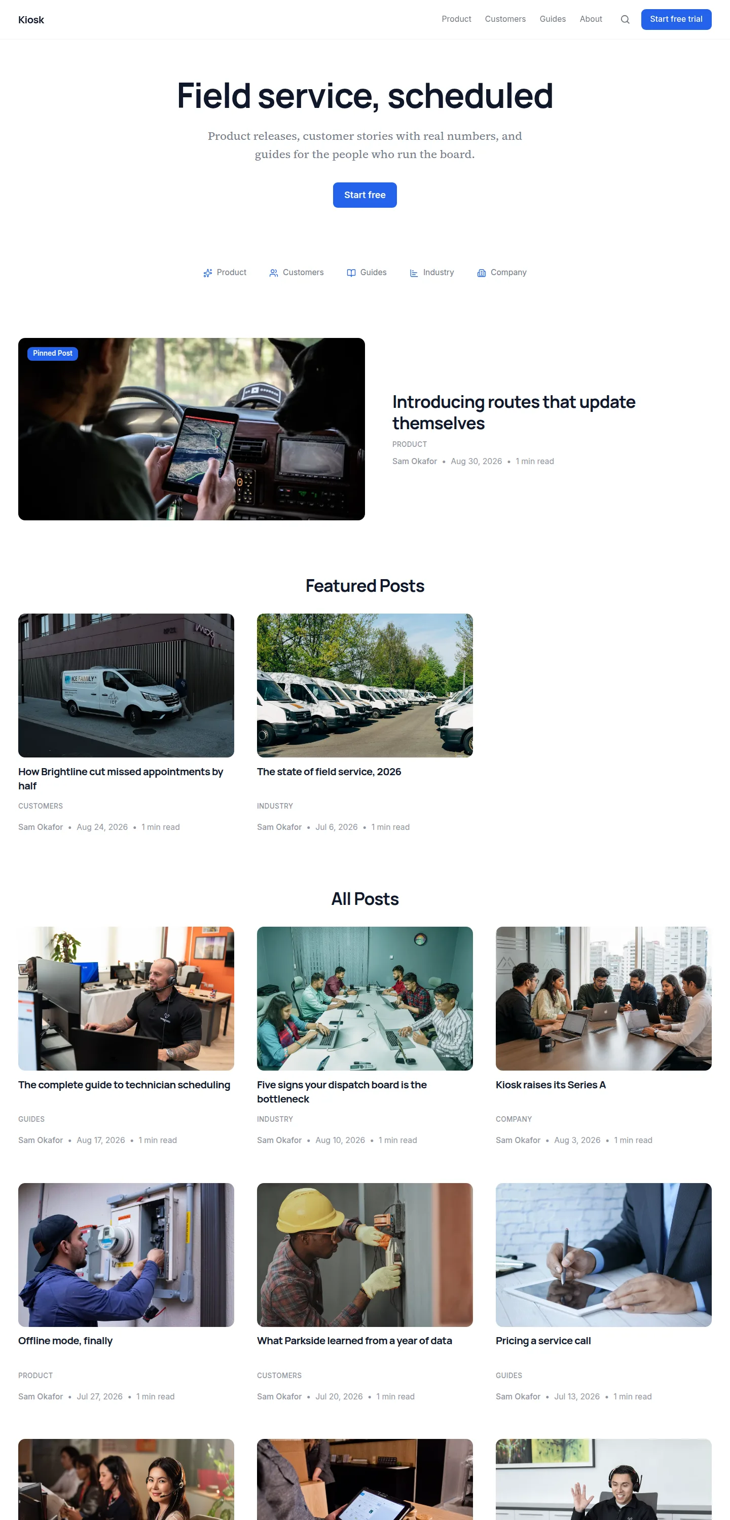
Every page of the demo site, whole. Click one to see it full size.
Start your blog on folio today
Start with folioFour things folio decides
The choices that make it this template and not another.
The plate is a picture and a name.
No excerpt, no author, no read time on the grid. The post page carries all of that. A plate that says less is a plate the photograph can carry, and a grid of them stays quiet however long it gets. The one line under each picture is the date and the topic, in small capitals, so the grid still tells a reader when and what.
A post without a picture is still a plate.
It gets the primary tint with its title set inside it, at the same size and proportion as its neighbours. Most new sites have no photographs yet, and folio is the one template in the range whose sparse state is a complete design rather than a fallback: a site with two picture-less posts is two tinted plates and a name, and it looks finished.
Pinned is marked, not enlarged.
A pinned post leads the grid and says "Pinned" in its small-caps line, and it is exactly the size of every other plate. Enlarging it would reintroduce the hierarchy the template refuses. The same goes for featured posts: marked, in order, equal.
The masthead is centred; the post is not.
The site's title, description and call to action sit centred above the grid, because they introduce the page. The post's title sits left on the reading measure, because a byline is a left-aligned object and the title should share its edge. Those are the two alignments on the template, and each surface uses the one its content asks for.
And 4 moreFewer
One frame, everywhere.
76rem on every view, the narrowest of the three-column templates, because two wide plates want a tighter page. The header and the footer are that frame made visible and never change width between pages.
Loud is one object per page, and it is always the ask.
The subscribe panel is the only filled shape: on the home after four plates, on the post after the article. The customer's menu CTA is a filled pill in the chrome and belongs to them, not to the template. The sidebar form beside the article takes the quiet tint, because it is on screen for the whole read.
Corners are the roundest in the range.
Plates at a full rem, every control a pill, furniture at half a rem. Nothing on the template is drawn with a line except the hairlines that separate the chrome from the page and one row from the next.
Contents beside the body, never beside the title.
The rail is capped at 14rem and sits against the measure, and it scrolls inside itself when an article has more headings than the viewport has room for.
Everything folio comes with
- Front page, article, topic and tag pages, author pages, search and 404
- Pinned and featured posts
- Table of contents on articles, beside the text
- Lead form after the article, a sidebar form, and an exit popup
- Text to speech with a built-in player
- Comments, or Disqus
- FAQs, tags, author bios and co-authors
- Light and dark
- Your fonts, your colours, your corner style
- Translations, with every string of the template translated
What folio declines
A setting the design has decided against. Turning it on in the dashboard changes nothing on this template, and the dashboard says so next to the toggle.
- A picture on the front-page subscribe panel: the page above it is pictures.