Templates/atrium
Template
atrium
Company blogs that want to feel calm and current
Soft panels on a plain ground: no rules, no uppercase, sentence-case pills. One inverted panel per page at most, always the subscribe. The lead panel's photograph runs to its own edge.
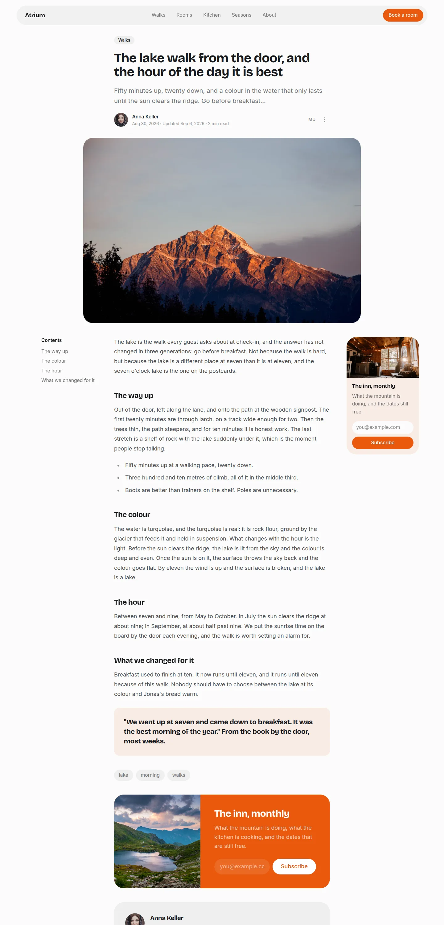

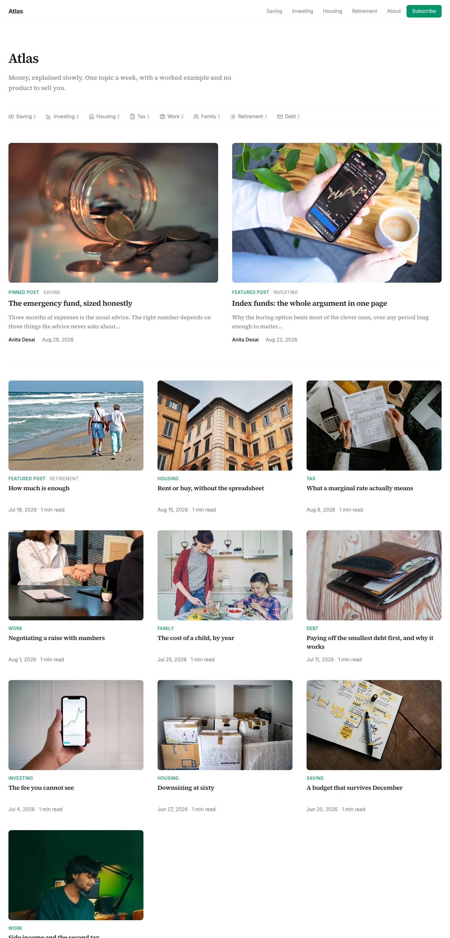
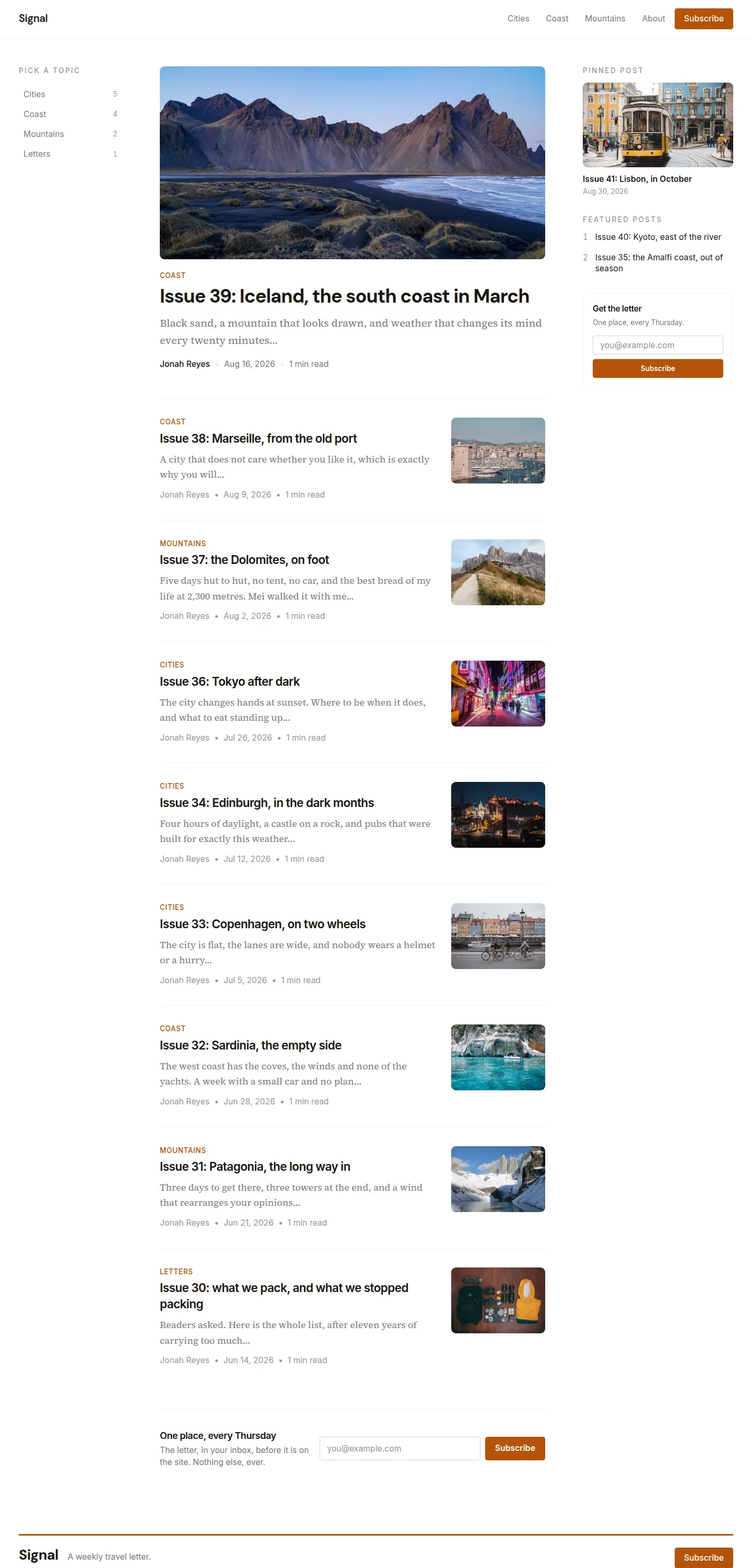
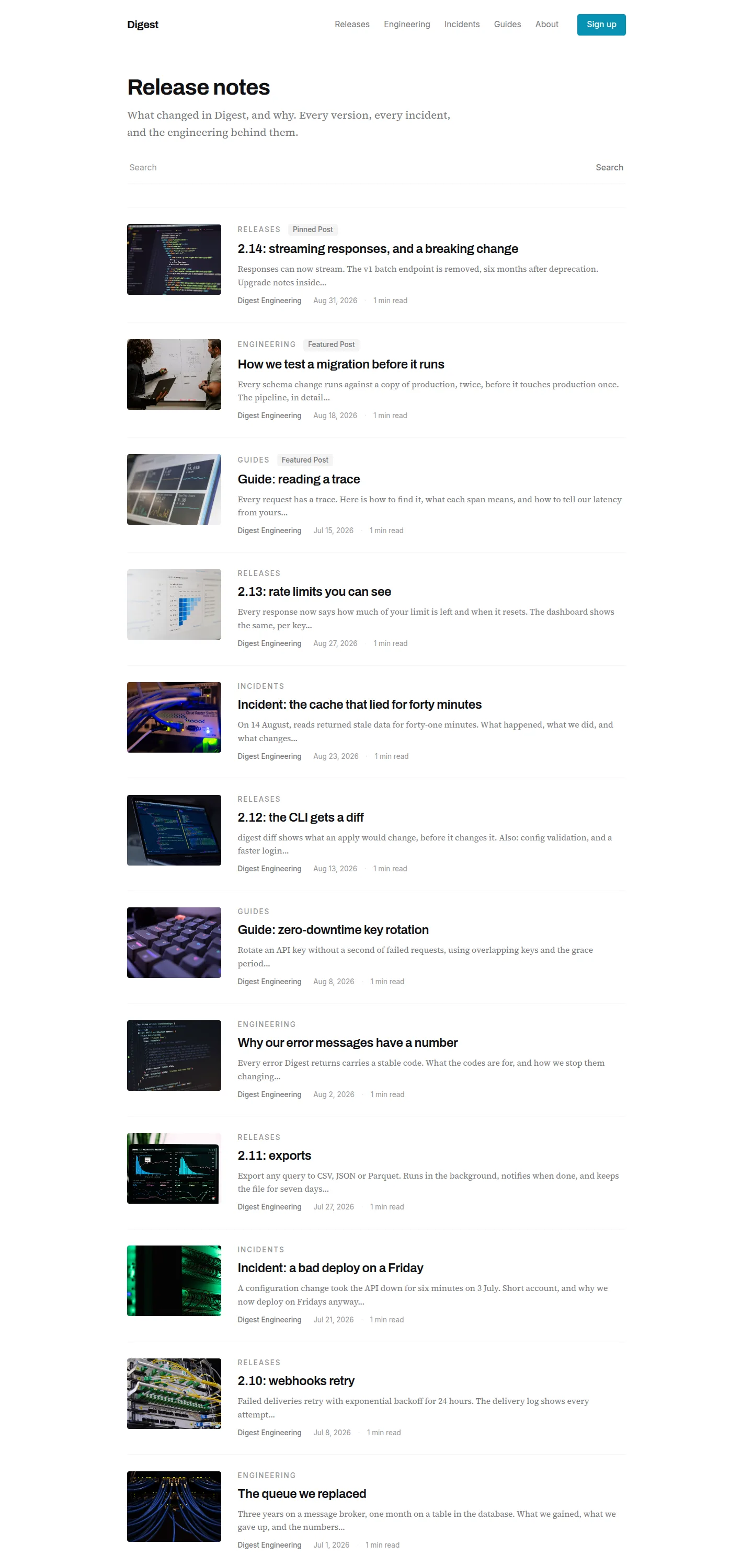
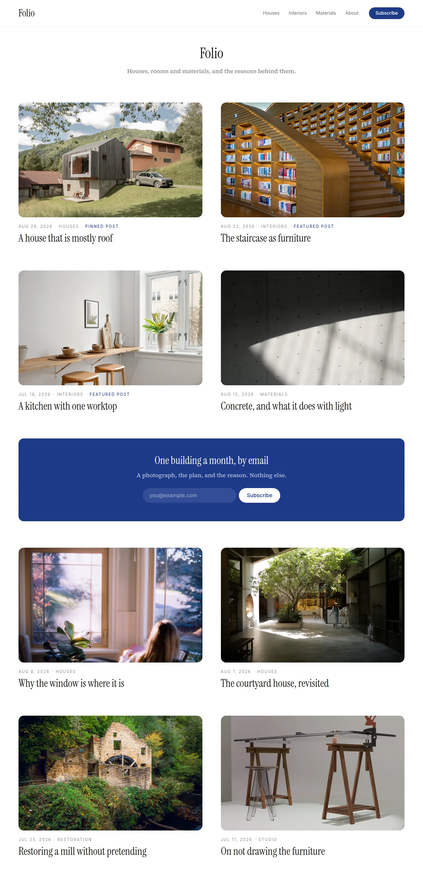
Every page of the demo site, whole. Click one to see it full size.
Start your blog on atrium today
Start with atriumFour things atrium decides
The choices that make it this template and not another.
The lead panel's photograph runs to the panel's own edge.
Everything else on the page is contained, so the one element that breaks its frame reads as confidence. It happens once. Twice would read as an accident.
Loud is one object per page, and it is always the subscribe.
On a page this quiet, a solid panel of your primary colour is the loudest thing on screen, so it is spent on the one action the site owner cares about. Nothing else gets to shout.
The text column decides the lead's height; the image fills what it is given.
Left in normal flow, a tall cover image inflates the whole panel. The image is absolutely positioned so the words set the size and the photograph obeys.
Pinned first, then featured, then everything else.
The pinned post is the lead and says so with a pill. Featured posts fill the cards, each tagged, and any beyond the cards open the archive list still carrying their tag. Nothing the author chose to highlight is ever invisible.
And 7 moreFewer
Only complete rows get to be cards.
Six or more featured posts earn a second full row of three, with the tint repeating in the middle of each row. A partial second row would be an orphan card in a three-column grid, so remainders stay in the list. Two rows is the ceiling: past that, a highlight wall stops being a highlight.
The hero is earned, never manufactured.
Your explicit featured image becomes the one element wider than the reading measure. Without one, a post that opens on an image gets that image promoted to the same width, the body's own image, so it can never appear twice. A post that opens in prose gets no hero at all, and an image buried mid-argument stays where you put it.
Chronology is dated, curation is not.
The archive rows show their dates: a chronological index is exactly where readers scan for recency. The lead shows its date only when it is simply the newest post. Anything placed by choice, the pinned lead, the featured cards, the featured rows above the list, carries no date, because a showcased evergreen piece stamped with an old date is worse off for it, and an old date at the top of a fresh list reads as a sorting error. All of it obeys the site's hide-dates setting.
Bylines live on the lead and the post page, not on cards.
Most sites have one author, and the same name and face repeated four times above the fold is decoration pretending to be information.
Cards in a row share their geometry.
Equal heights, titles starting on one line, read times on one baseline, and the pill slot reserved whenever any sibling carries a pill, so a mixed row cannot misalign.
The subscribe panel keeps its natural height and sits sticky beside the archive.
Stretched to match a long list, it becomes a huge dark box with a small form floating in it. Compact and sticky, it stays in view while the rows scroll past.
Contents are off by recommendation, quiet when on.
The standfirst orients the reader up front; display-weight headings orient them in flow, so atrium's recommended setting is contents off. A site that keeps the toggle on gets a muted left rail on wide screens, plain text with no panel, and an inline disclosure below that: one quiet row above the article, closed until asked.
Everything atrium comes with
- Front page, article, topic and tag pages, author pages, search and 404
- Pinned and featured posts
- Table of contents on articles, beside the text
- Lead form after the article, a sidebar form, and an exit popup
- Text to speech with a built-in player
- Comments, or Disqus
- FAQs, tags, author bios and co-authors
- Light and dark
- Your fonts, your colours, your corner style
- Translations, with every string of the template translated