Templates/atlas
Template
atlas
Publications with many topics and a steady cadence
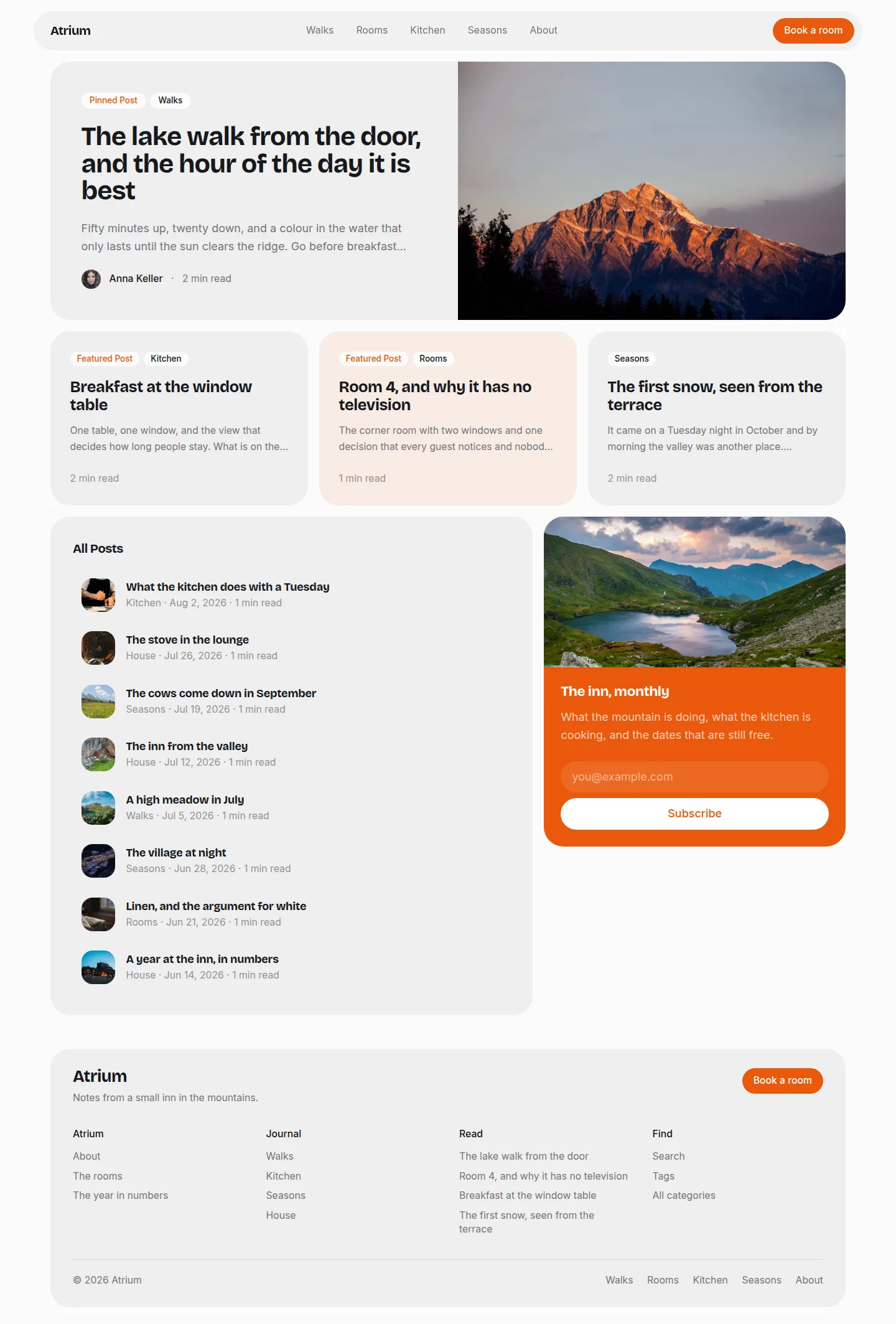
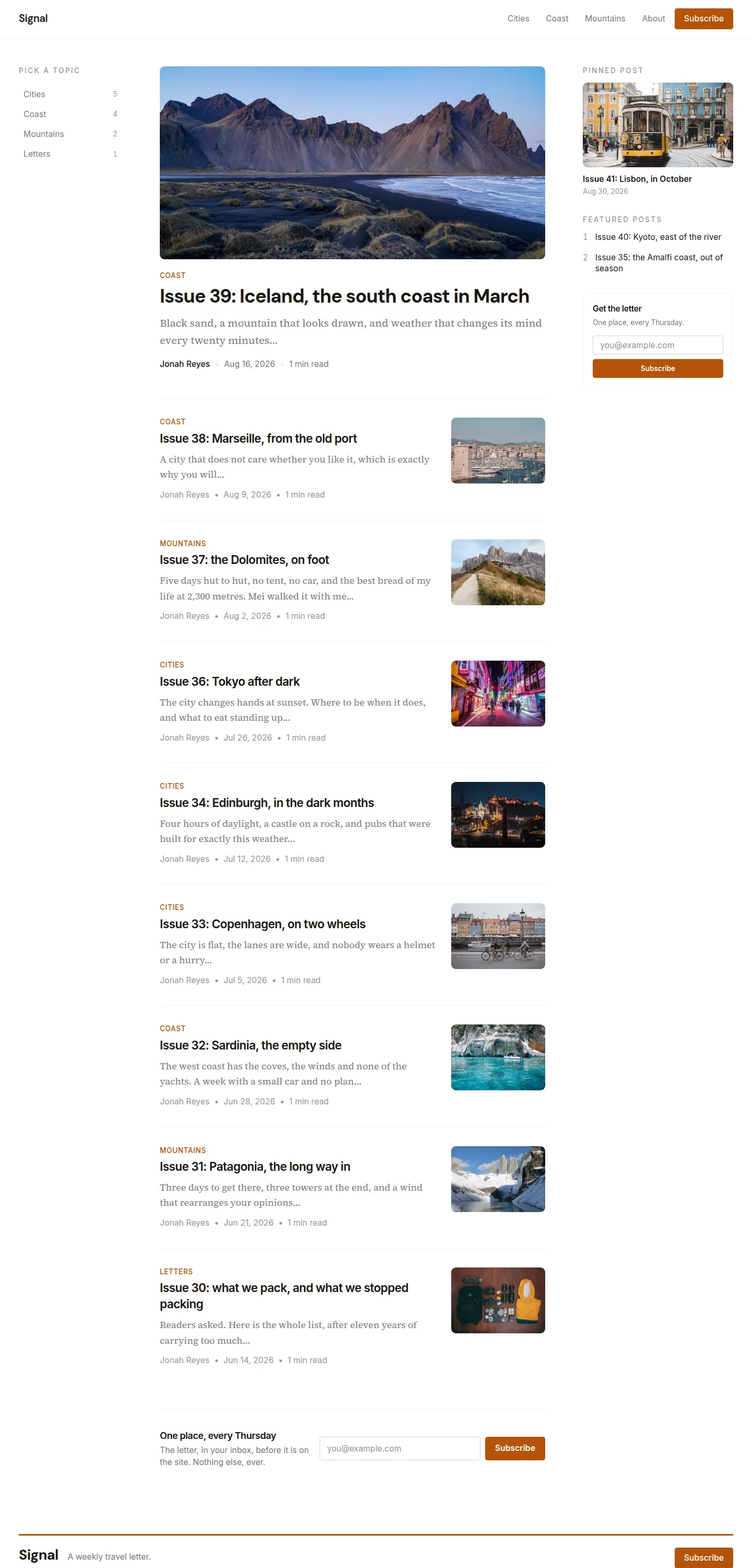
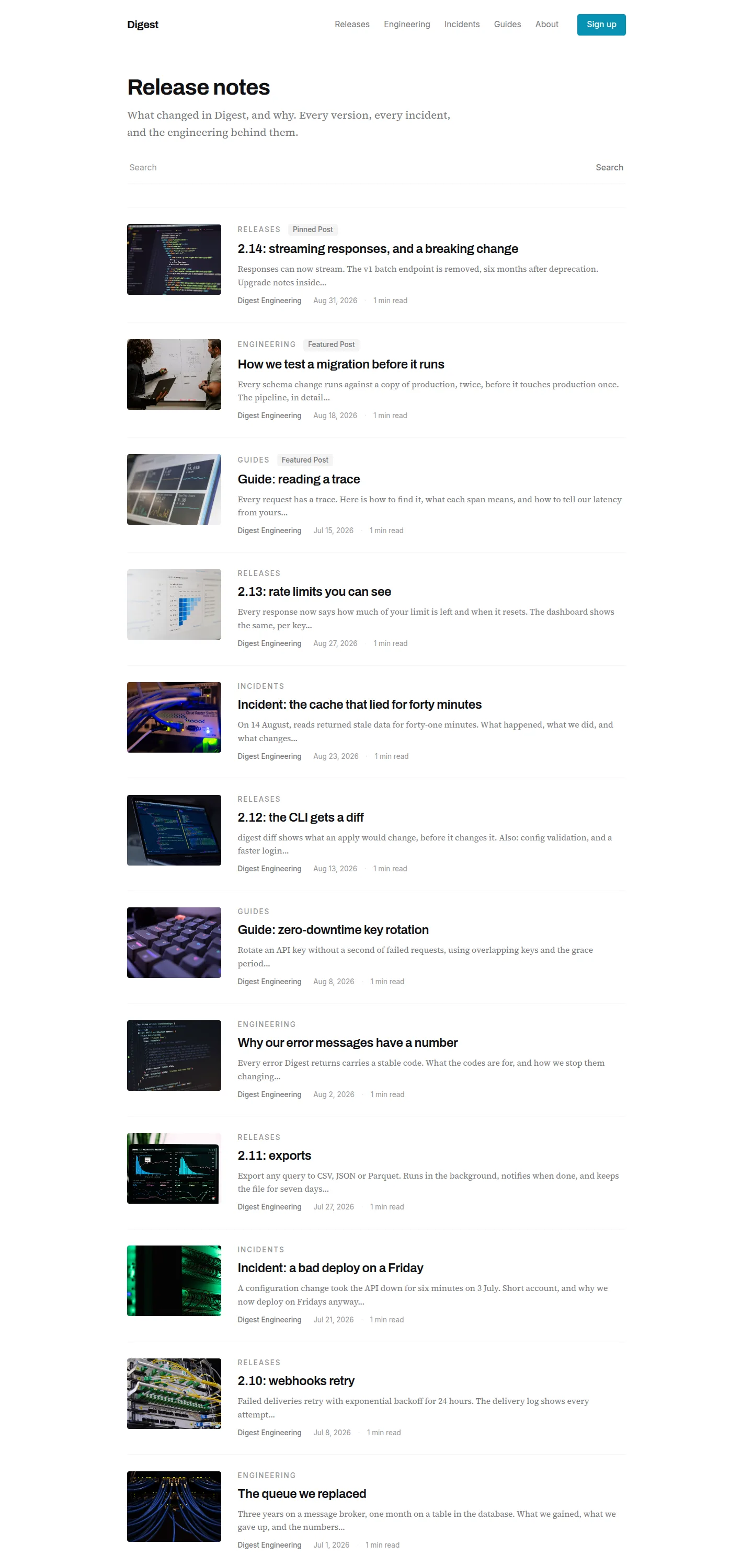
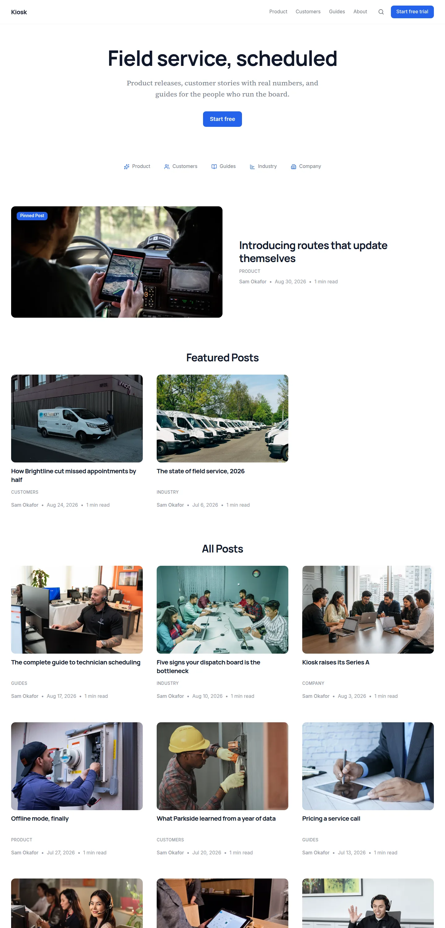
A grid that spends its whole width on the posts. No hero image, because on a grid the posts are the images, and no sidebar, because a rail costs a column. Topics sit on a rule as a row. Everything is separated by hairlines rather than by tone.
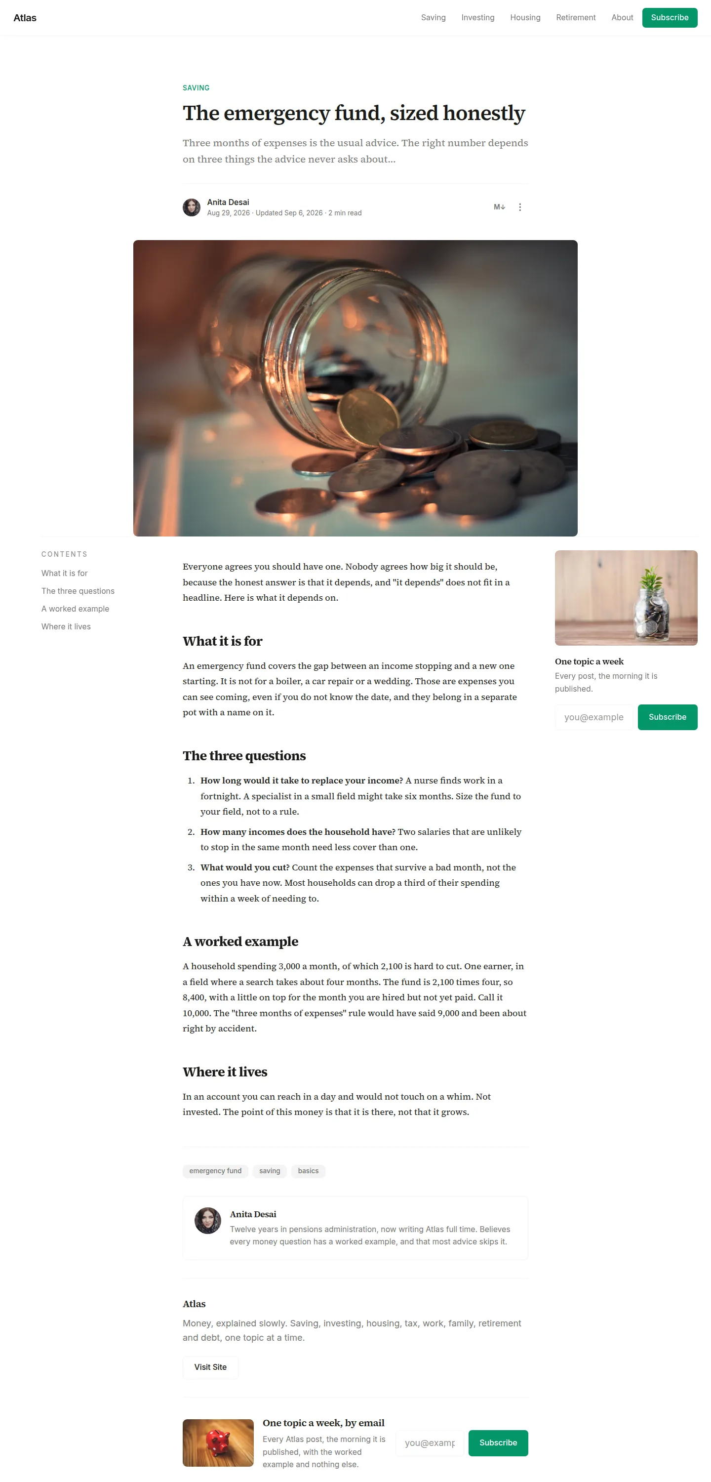
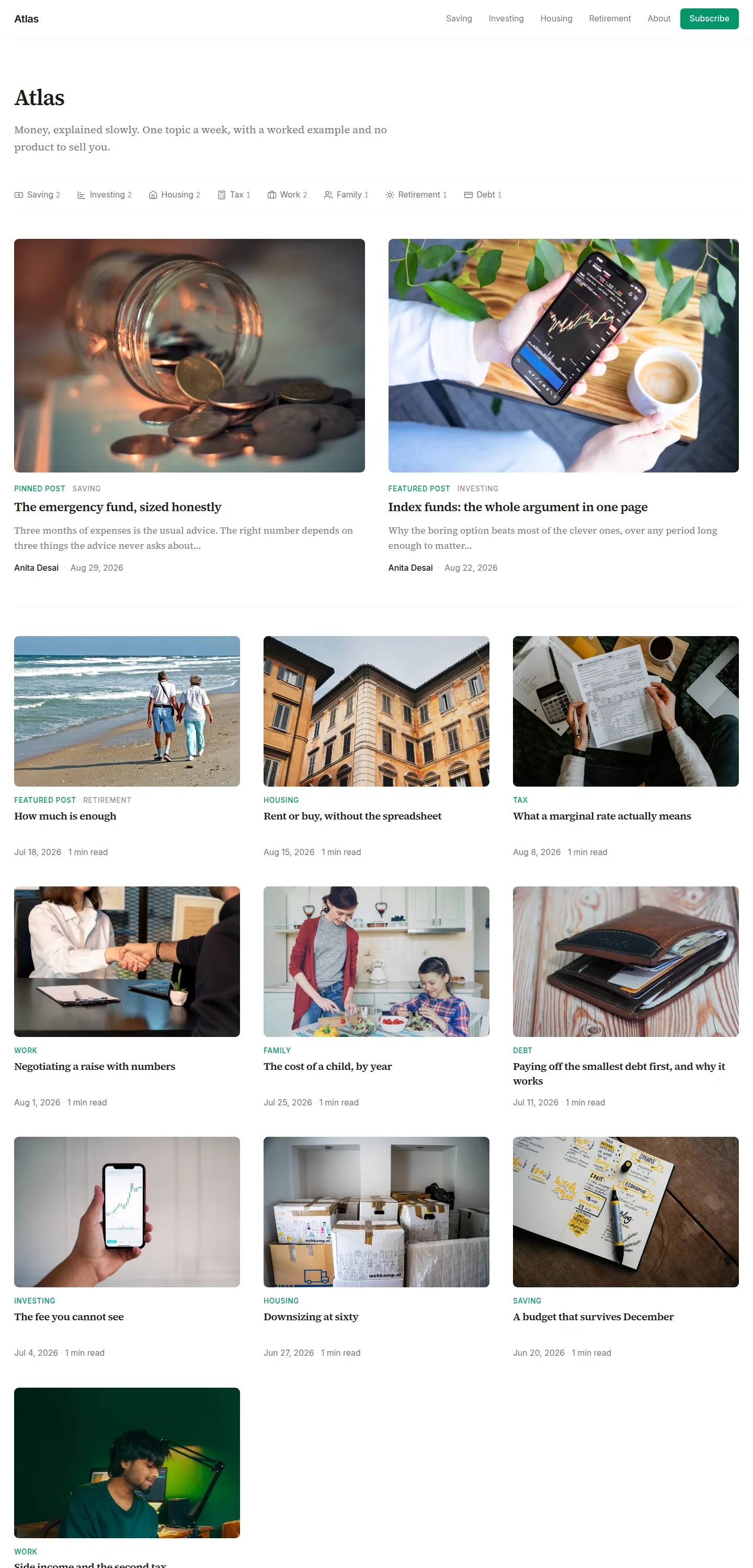
Every page of the demo site, whole. Click one to see it full size.
Start your blog on atlas today
Start with atlasFour things atlas decides
The choices that make it this template and not another.
Topics sit on the rule, as a row.
This is the signature. It is the site's topic navigation on the homepage, the breadcrumb on a category page, the filter on search, the author's beat on an author page, and the switch between the two index pages on those. One device, answering a different question on each surface, so a reader learns it once. It renders nothing at all when there is nothing to put in it: a rule with no row under it is the shape of a feature that failed.
The first row is two wide entries, on the homepage only.
That is hierarchy without a hero, so a site with no pinned and no featured post still gets a front page with a shape. Inside a single category the device is dropped, because every post there is equally on topic and the wide row would only be saying "these two are newest", which the dates already say. It also means page two of a category looks like page one.
Three up, and no excerpts.
An excerpt on a small card is three lines nobody reads, and it is the reason most grids look noisy. The excerpt appears on the two-up cards, where there is room for it to be read, and on a card with no image, where it replaces the picture rather than sitting under a grey rectangle.
The post page has no contents rail either.
Growing one on the single page that has no grid would make it look like a different template. The contents become the same device: a numbered horizontal row on the same rule, inside the same measure as the body. Numbered, because a flat row loses the sense of order that a stacked rail gets for free.
And 4 moreFewer
Everything the reader reads sits in one 700px column.
Title, contents, body, tags, author, subscribe, read next: one left edge and one right edge the whole way down. The cover image is the single exception, wider than the text at 900px and centred on the same axis, so the edges stay symmetrical even where they differ.
Search is the one departure from the grid.
A query makes the matched sentence the thing being compared, and three matched sentences side by side cannot be read in order, so results are rows in a single column. The thumbnail stays: a reader who arrived from the grid recognises a post by its picture before they read its title.
The tag index is three columns of rules, not a cloud.
At 80rem a wrapped row of pills is a ragged block with no alignment anywhere in it, and the counts are the reason a reader opens that page. In columns they line up on a right edge and can be compared down the list. Every tag is set at the same size, because a weighted cloud makes the rare tags unreadable in order to say something the numbers already say.
A thin site looks small on purpose.
With no categories, no authors and four posts, the topic row disappears rather than rendering an empty rule, the grid drops to two columns so four posts fill two tidy rows instead of trailing off, and the container narrows with them.
Everything atlas comes with
- Front page, article, topic and tag pages, author pages, search and 404
- Pinned and featured posts
- Table of contents on articles, beside the text
- Lead form after the article, a sidebar form, and an exit popup
- Text to speech with a built-in player
- Comments, or Disqus
- FAQs, tags, author bios and co-authors
- Light and dark
- Your fonts, your colours, your corner style
- Translations, with every string of the template translated